
HOW TO CHOOSE A PRESET
I often get the question : how can I choose the right preset for my content ? How can I know that it will fit my project or the image I want to create ? I am going to give you the guidelines to find the proper match for you today !
SPOT YOUR UNIVERSE
Identifying the type of photos you make and you will post is crucial. You want to ask yourself : What do I photograph ?
- Is it landscape ? If landscape what type of landscape ? Is there a specific theme that is recurrent ?
- Is it lifestyle ? If yes what type of lifestyle, is it fashion ? Food ? Is it colourful rather than very minimalistic ?
Look at what you want to put forward, what type of aesthetic do you want to showcase ?
-
PORTRAITS / LIFESTYLE PHOTOS : usually work great with neutral packs such as AIRY, HOME, FAWN, BOHEMIAN, RETRO, DUSK, ESPRESSO, COCOON

-
LANDSCAPE / TRAVEL PHOTOS : work great with more colour specific packs such as REUNION, MALDIVES, CITY, OMAN, NATURE, NORDIK, TROPICAL etc…

-
SHOP / BRANDING : will work great with a simple pack like AIRY or a pack that will suit the line of your branding if you sell outdoor gear for example a pack like DUSK or ESPRESSO or MINIMAL BLACK will probably match what you sell and your logo. You can also choose a specialised package if you own a restaurant or if you are a cook SOUL FOOD or FOOD LOVERS will work great !

💡 The key point here is to try to identify what you will photograph and communicate with others and find a pack accordingly to it
FIND YOUR PALETTE
When you are done with the first step try to narrow down the thing you photograph and identify the main colours in your photos :
- Is there a majority of green / white / beige tones / blue ? Make a moodpboard or even take a look of your camera roll grid from far away and spot the general tone.

If you can identify a main colour you can choose a preset pack with a grid close to this colour and it will boost this tone just right !
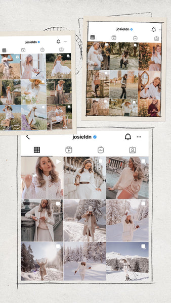
If you like at my example I have a lot of desert photos from Dubai in my camera roll, if I was to make a feed of it I could use the Namibia preset pack to boost the orange / brown / golden tones.
- For example you if you take fashion / portrait photos, in general your photos are quite minimalistic and you spot that you have neutral tones as a palette : it will be very handy to choose a preset that will boost these tones such as : FAWN, HOME, TITANIUM, BOHEMIAN these packs showcase neutral tones and it will fit your content perfectly.
💡 The key point here is to understand that a preset cannot completely modify the existing colours on your photos, the presets tweak the existing colours on your photos to make them match a certain palette, this is why for an optimal result you should choose a pack that matches the type of colours your photos contain.
Your photos don’t have a specific palette you can spot and there is a bit of everything ?
In that case the presets might look great on some pictures and less great on others. If your goal is to create an aesthetic grid such as the ones you see on the presets pack I would advise you to decide for a colour theme you like and to adapt what you photograph.

WORK THE OTHER WAY AROUND : CHOOSE A PACK AND TAKE PHOTOS TO MATCH THE THEME
It works the other way as well, let’s say you want this perfect white and bright feed but your camera roll showcase a lot of colours, here is what you can do : take pictures with more white.
Adapt what you photograph so that the preset can work its magic : if you pick a white preset pack you need to feed the preset some white to work with. Look around find a white wall, white outfits, white details, try to avoid strong colours like green, strong blue : avoid taking photos where you see the grass behind you with a bright blue sky. Focus on minimal colours for your background neutral materials like wood, wool etc it will help you achieve your goal.

PLAY WITH THE PRESETS PACKS
The creations are limitless with presets ! There are many ideas which can inspire you to use them
- Create a mix match post a specific colour every two photos, this especially works for colourful feeds such as Blue and yellow, or orange and neutral etc.. Create a crisscross on your grid and mix and match your palette.

- Create a fading palette, now this is harder as you need to have photos with tones that evolve accordingly to the new palette you are transitioning. For example you can go from very brown to beige to more pink to bright pink. You can create a transition with a fading palette that progressively blends. The key to do this is to incorporate elements of the previous colour theme to the new ones for the transitioning part.
For example you are gradually going from blue to yellow in your transitioning photos you can take pictures including a lot of sky which will align with the previous blue feed but wear a yellow top / dress or include sunflowers etc .. yellow elements. While progressing more and more to the yellow feed you can invert have a majority of yellow such as a wall and add a touch of blue (denim, clothing etc …) by doing so you create a smooth transition.

- You can stick to a style and always keep you feed with a certain theme. This is especially brilliant if you communicate your photos for branding purposes, this helps identify your message easily and make it very obvious to recognize you.

- You can play with the neutrals from more brown around autumn and more beige in spring but get a general neutral palette which slightly varies from time to time. This also works with bold colours.
To sum up how to pick a preset :
- Look at the type of photos you take and pick a pack aligning with this type of photography
- Look at your general palette in your photos and pick a pack of preset that will emphasis it
- Pick a pack a preset with your ideal theme and make photos with colours which align with this pack
- Be creative with your content to express yourself
Still not sure of the result ? Send me your unedited photo to sample at contact@looxpreset.com or in the DMs at @cyriellegoupil I will try on the presets and show you the result on your photos 😊